The Studio forms are dynamically generated based on the collection schema defined in your content configuration file. This behaviour applies whether you’re editing the frontmatter of a Markdown file or a JSON / YAML file.
Defining your form with zod Schema
Nuxt Content leverages zod to let you define a type-safe schema for your content. This schema not only validates your data but also powers the form generation in Studio.
Built-in zod Helpers
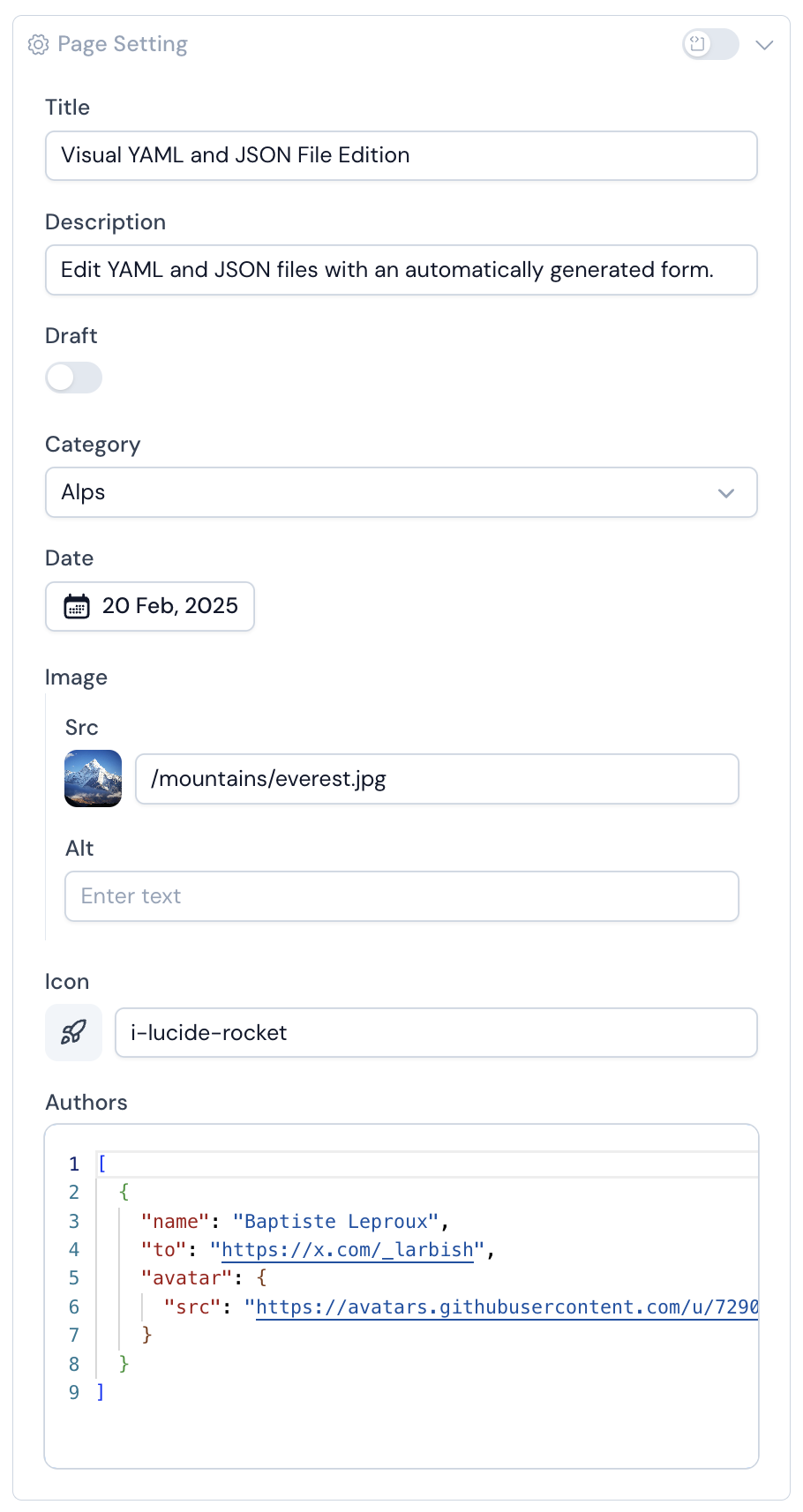
You can define your Content schema by adding the schema property to your collection and by using a zod schema.
@nuxt/content exposes a z object that contains a set of Zod utilities for common data types.
export default defineContentConfig({
  collections: {
    posts: defineCollection({
      type: 'page',
      source: 'blog/*.md',
      schema: z.object({
        draft: z.boolean().default(false),
        category: z.enum(['Alps', 'Himalaya', 'Pyrenees']).optional(),
        date: z.date(),
        image: z.object({
          src: z.string().editor({ input: 'media' }),
          alt: z.string(),
        }),
        slug: z.string().editor({ hidden: true }),
        icon: z.string().optional().editor({ input: 'icon' }),
        authors: z.array(z.object({
          slug: z.string(),
          username: z.string(),
          name: z.string(),
          to: z.string(),
          avatar: z.object({
            src: z.string(),
            alt: z.string(),
          }),
        })),
      }),
    }),
  },
})
Native Inputs Mapping
Primitive Zod types are automatically mapped to appropriate form inputs in Studio:
- String → Text input
- Date → Date picker
- Number → Number input (counter)
- Boolean → Toggle switch
- Enum → Select dropdown
Custom Inputs Mapping
Content goes beyond primitive types. You can customise form fields using the editor method, which extends Zod types with metadata to empower editor interface.
This allows you to define custom inputs or hide fields.
Usage
mainScreen: z.string().editor({ input: 'media' })
Options
input: 'media' | 'icon'
You can set the editor input type. Currently both icon and media are available since there are handled in Studio editor.
hidden: Boolean
This option can be set to avoid the display of a field in the Studio editor.

